
Photographic Cabinet Card Mounts: Front Printing--Classic Cabinet Cards--Front Printing (1866-99)
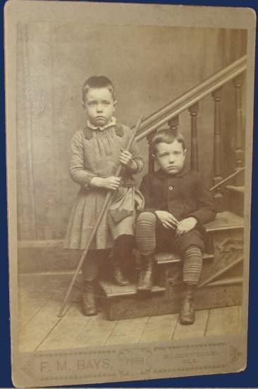
Figure 1.-- Classic 19th century cabinent card mounts were done with two styles of front printing. Both had the studio at the left and the location at the right. This American cabinet card was the style with plain printing. The studio was F.M. Bays in Ellisville, Illinois. The date in the center (1889) was not very common. center was not very common.
|
|
We notice a few types of standard printing on the bottom front of the card below the image which was pasted on the card. The standard approach was to have the studio name on the left and location on the right. This primarily meant the name of the studio, often in fancy lettering on the left. And on the right was the city and state, sometimnes the street address was added. Lettering styles varied. We see both fancy caligraphy and plain lettering, but the basic format of studio name and city was very commom. Here we see one of tgese cards with plin printing (figure 1). This format was very common from the first cabinet cards in the 1860s through the 1890s. Not all cabinet cards were done like this, but a very large percentage of American cabinet cards conformed to this approach. The level of conformity is interesting given the huge number of photgraphic studios spread all over the country. Of course there were a smaller number of companies that supplied the mount card stock. The caligraphy cards with a kind of logo for the studio seems the most common. We see these formats very commonly during the 1860s-90s and even a few after the turn-of-the century, mostly in the early-1900s (1900-05).
HBC

Navigate the Boys' Historical Clothing Web Site:
[Return to:Main cabinet card front printing page]
[Return to:Main cabinet card mount page]
[Return to:Main cabinent card page]
[Return to:Main photographic print type page]
[Return to:Main photography page]
[Introduction]
[Activities]
[Biographies]
[Chronology]
[Clothing styles]
[Countries]
[Bibliographies]
[Contributions]
[FAQs]
[Glossaries]
[Images]
[Links]
[Registration]
[Tools]
[Boys' Clothing Home]
Navigate the Boys' Historical Clothing Web Site:
[Sailor suits]
[Sailor hats]
[Buster Brown suits]
[Eton suits]
[Rompers]
[Tunics]
[Smocks]
[Pinafores]
Created: 12:26 PM 6/22/2012
Last updated: 12:27 PM 6/22/2012